Ubuntu 26.04 Introduces Two New Default Apps
Ubuntu 26.04 updates its default apps with a more modern, streamlined experience. Here’s a quick look at what’s new and what changed.

If you’ve been using Ubuntu for a while, maybe since the early 2010s or even longer, you know that the "look" of the desktop has stayed remarkably consistent. We’ve grown used to the same video player, the same system monitor, and the same basic window designs. But as we move into 2026 with the release of Ubuntu 26.04 LTS, that’s all changing.
Ubuntu is currently undergoing its biggest visual "refresh" in over a decade. It’s finally retiring the "old guard" of applications that have served us for twenty years to make room for a new generation of software. This isn't just about making things look pretty; it's about making Ubuntu feel fast, fluid, and polished as a modern smartphone or the latest macOS.
In this guide, I’m going to walk you through the biggest changes: the arrival of Showtime and Resources, the move to the Libadwaita design language.
Why the "Old Guard" is Retiring
Before we look at the new apps, we have to acknowledge the ones leaving. Applications like Totem (the default Video player) and the classic GNOME System Monitor have been staples of the Ubuntu ISO for almost as long as the project has existed.
I remember first installing Ubuntu 10.04 and seeing these apps. They were reliable, but they were built for a different era of computing, an era of low-resolution monitors, spinning hard drives, and basic graphics.
As we’ve moved into 2026, our hardware has outpaced these apps. We now have 4K HDR displays, lightning-fast NVMe storage, and powerful GPUs that the old apps simply weren't designed to showcase.
By moving to these new defaults, Ubuntu isn't just "updating" its apps; it’s rebuilding the core experience from the ground up to match the power of modern PCs.
Showtime: The Video Player We’ve Been Waiting For
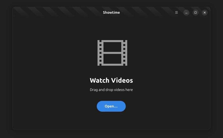
Let’s start with the most visual change: Showtime. For years, Totem was the default, but it often felt like it was fighting against the user. Showtime fixes this by focusing on one goal: letting you watch your favorite movies and video files without any hassle.
Watch Without Distraction
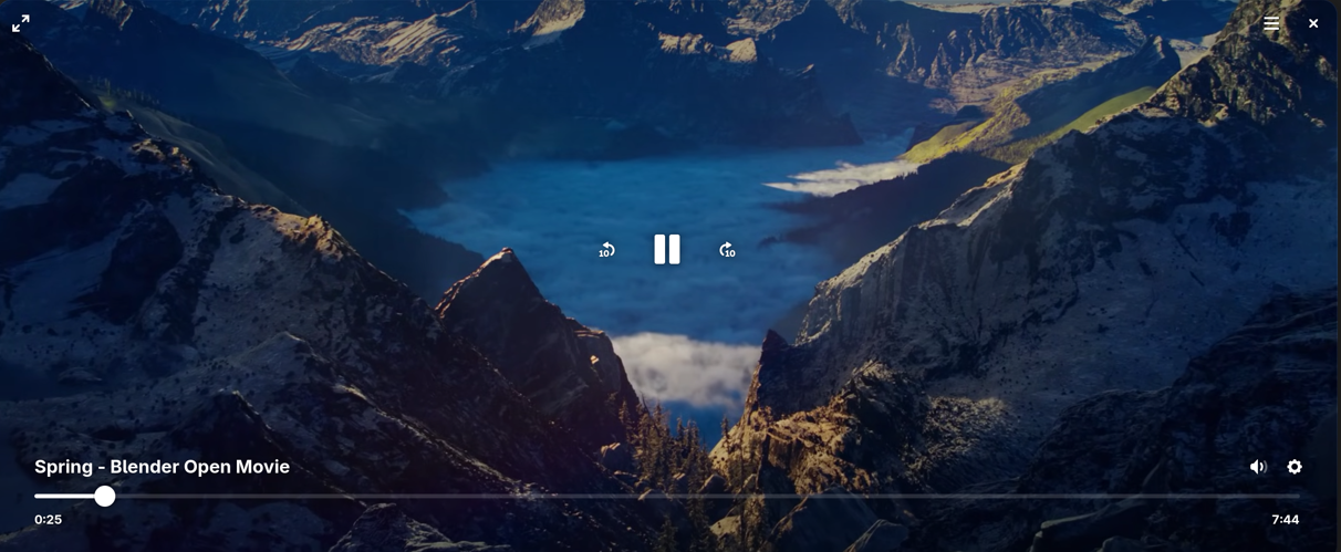
The standout feature for me is the immersive interface. Showtime features simple playback controls that intelligently fade out of your way the moment you start watching. It creates a clean, cinematic experience where the software disappears, leaving only your content.
But don't let the simplicity fool you. It’s packed with the tools I actually use:
- Adjustable Playback Speed: Perfect for breezing through long tutorials or slowing down a complex scene.
- Language & Subtitles: It handles multiple audio tracks and subtitle files seamlessly, making it a great choice for international cinema fans.
- Quick Screenshots: I love that there’s a dedicated button for capturing high-quality stills from whatever I’m watching.
Performance Under the Hood
The real power of Showtime isn't just in the menus you see, but in the engine under the hood. For years, the "old guard" of Linux apps relied on older versions of the GTK toolkit. While reliable, those older versions were built before high-resolution 4K video and powerful graphics cards were the standard.
Showtime is built from the ground up with GTK4. Without getting too technical, this shift is like moving from a reliable old sedan to a modern electric vehicle. GTK4 allows the app to use your computer’s graphics card (GPU) much more efficiently.
The result is a player that handles high-fidelity MKV files and heavy 4K footage shot with ease. You’ll notice it most when seeking through a video: where older players might hang for a second as they try to catch up, Showtime is instantaneous, it makes the entire desktop feel faster and more responsive
In older apps like Totem, the computer’s main processor (CPU) often had to do the heavy lifting of "painting" the video frames on your screen, which could lead to stuttering or that annoying "buffering" lag when you first open a file.
Resources: Comprehensive Monitoring for the Modern Age
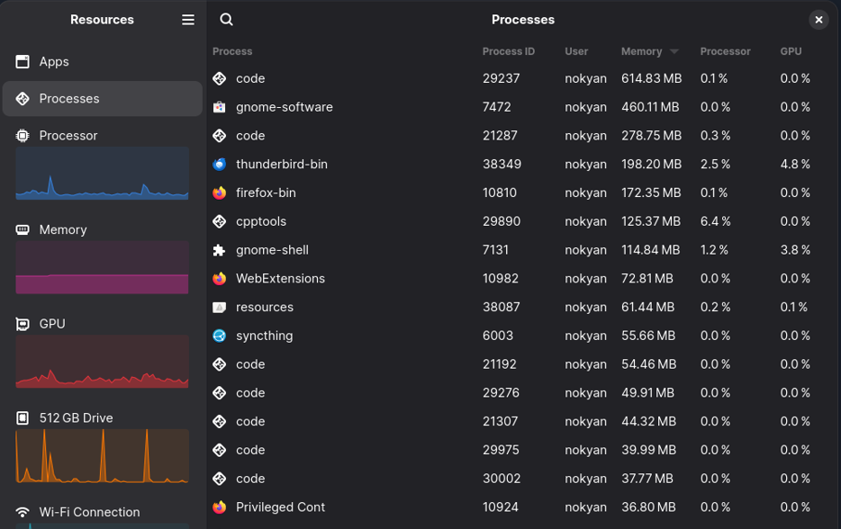
While Showtime handles your entertainment, Resources handles the "health" of your machine. Replacing the classic GNOME System Monitor, Resources is designed to feel right at home on a modern Ubuntu desktop by using the sleek libadwaita design.
It’s not just a process list; it’s a comprehensive health check for your entire PC. I’ve found it much more intuitive for checking how my hardware is actually holding up under load.
One detail I really appreciate is that the Ubuntu team chose Resources specifically for its superior accessibility. By utilizing the modern Libadwaita framework, it offers much better keyboard navigation and seamless integration with the Orca screen reader. This ensures that managing system hardware is something everyone can do, regardless of how they interact with their computer.
Unlike the old tool, which could be a bit picky about what it showed, Resources supports monitoring every critical component in a single, beautiful view:
- CPU & Memory: Watch your processor cores and RAM usage in real-time.
- GPU & NPU: Finally, a default tool that tracks your graphics card and even the new AI chips (NPUs) found in 2026-era laptops.
- Network & Storage: See exactly how much data your network interfaces are pushing and keep an eye on the read/write speeds of your storage devices.
- Batteries: For those of us on laptops, it provides a much more detailed view of battery health and usage than the standard top-bar icon.
Keeping the Old Guard Close
I know that change can be frustrating. Some of you might have workflows that depend on a specific feature of the old System Monitor or the way Totem handled playlists.
If you aren't ready to move on, don't worry. Ubuntu's developers are providing a Safety Net. Even though Showtime and Resources are now the defaults, the "old guard" apps are still available in the archives. If you find that you truly can't live without the old design, you can simply install them via the App Store.
However, I highly encourage you to give the new defaults a week. Once you get used to the distraction-free nature of Showtime or the detailed hardware stats in Resources, going back to the old versions feels like stepping back in time.
As we move toward the official release on April 23, 2026, these apps will only continue to gain stability and new features. Whether you are a long-time power user or a newcomer, there has never been a more exciting time to be an Ubuntu user. The "Resolute Raccoon" is setting the foundation for the next five years, and it looks better than ever.